Job Well Done Steak Giveaway Email Banner
Email banner advertising a giveaway designed to promote positive employee morale.

Rebrand Concept for LIFT
Rebranding concept created for non-profit Long Island Forum for Technology, utilizing existing logo into new look for collateral materials.

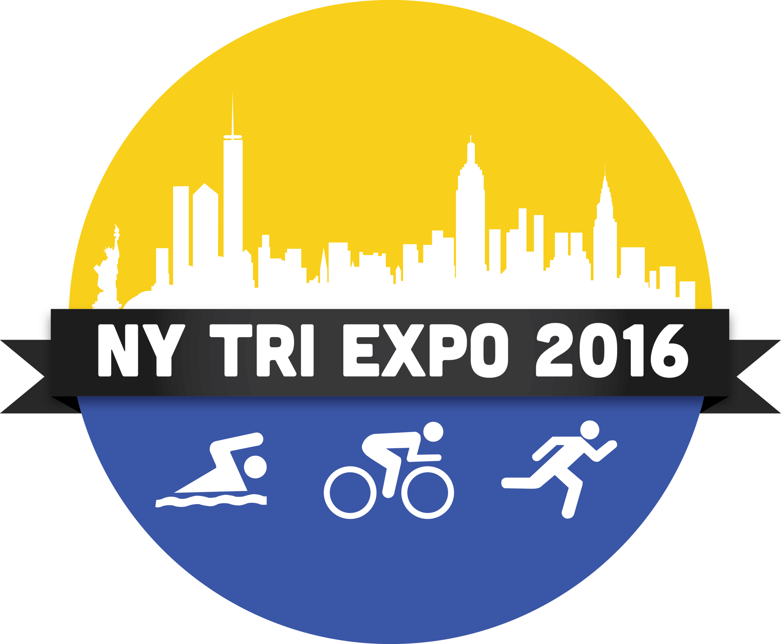
Triathlon Expo Final Logo
The final logo design for a potential triathlon tradeshow and expo. The design was a marriage between initial sketches and feedback from multiple sources. I worked to create a logo that incorporated the desires of each of the involved parties while still maintaining an appealing look.

HJMT Media Logo Concepts
A set of three logo concepts for a proposed new business. The center logo was selected as the final version.

Techie Triathletes Infographic
A quick infographic designed to accompany the findings of a research survey targeting the triathlete community. I used the conclusion regarding the triathlete community's use of technology as a theme.

Facebook Business Pages Infographic
An infographic designed to accompany research survey findings regarding consumer attitudes on Facebook business pages.

Quiche & Tell Flyer
This fun flyer for a food industry client uses a play on words to drum up interest in one of their namesake products- the quiche! Using a stock image from the client's archives, I deconstructed the quiche and ingredients from the glamor shot and rearranged on a white farmhouse table to further their wholesome and homemade brand.

Quiche & Tell Web Banner
To go along with the Quiche & Tell Contest, I created a web banner with a similar design to direct users to the preceding flyer to find out more about the promotion.

Mitten Campaign Postcard
A Canadian promo house we work with wanted to bring in more business during the long winter. We devised a campaign to send potential customers a single mitten with a call to action on a postcard to inspire them to call or visit to find out more (and retrieve their matching mitten). This client recently unveiled new branding so it was exciting to utilize that.

HilaryTopper.com Ad on Zeusvision Bus
This is one of the coolest things I can say I've had the pleasure of designing. Seeing your work on the side of a giant bus that will be roaming the streets of LA is nothing short of the highlight of my career so far.

Plymouth Rock Energy Folder Concept
My favorite design concept from a series of options for a corporate folder for this local, Long Island energy provider. It was nice to be encouraged to do a more geometric and abstract design for a corporate client.

Sounds of the Season Ad
One of the biggest challenges of working with clients in New York is that around the holidays, everything must be all-inclusive. We opted for an ad design that captured to magic of winter without overtly heading down Santa Claus Lane.

Teacher's Federal Credit Union Infographic
This infographic, created for a Long Island credit union, shows statistics on a number of banking trends relevant to the millennial generation, one of their key target demographics.

Great East Midtown Challenge Logo
The Great East Midtown Challenge is an annual event through the East Midtown Business Improvement District in Manhattan where challengers compete in a series of events hosted by local businesses. Proceeds from the event support the BID's Homeless Outreach Program. I wanted the logo to resemble a badge or medallion one might earn from a competitive event. I used a variation on the EMP's logo colors to keep branding consistent while still being fun and innovative.

Prosthetic Company Cover Photo
This Facebook cover photo was an original design for a start-up prosthetic company.

OSALI Construction Signage
This project was particularly exciting as the client, an orthopedic and sports medicine practice, wanted a sign to alert patients to their renovations, but only wanted to use typography to convey their message. Typography is an area I enjoy working in and feel that I excel in. I wanted to create a more minimalist sign that would still command the attention of patients- without the use of a bold, centered font.

East Midtown Partnership Brochure
Inside and outside designs of the East Midtown Partnership Brochure, informing about who the district is, what they do, where they are located and the various programs, events and resources available to visitors and businesses in the district. EMP has a lot of business and corporate interests, but wants to be perceived as bold and innovative. I tried to marry a modern, bright style with a clean, corporate layout

HJMT Social Media One Page
This internal marketing project for HJMT Public Relations came together rather quickly, but I was very pleased with the results and feel that it displays my expertise for displaying information in an easy to read fashion. We wanted to show the breadth of our past experience in social media as well as our successes and current capabilities to reiterate that we are evolving along with technology to meet clients' needs. Because the HJMT logo is very bright, I try to downplay the use of colors in our branded material with muted grays and a single highlight color.

HJMT Email Newsletter
This is an email newsletter I created for HJMT Public Relations designed in MailChimp and using graphic elements created in Photoshop.

Cook Chevrolet Subaru Ads
This ad was produced for a local car dealership in Northwest Colorado through their co-op program with Subaru. The corporate ad agency working with Subaru would send out approved images which I then resized and reformatted to fit our newspaper's sizes as well as adding the local dealership's featured vehicles and prices. These ads gave me excellent experience in working with corporate clients to create something from scratch within their strict branding requirements.

Cook Chevrolet Ad
This ad was produced for a local car dealership in Northwest Colorado through their co-op program with Chevrolet. The corporate ad agency working with Chevrolet would send out approved images which I then resized and reformatted to fit our newspaper's sizes as well as adding the local dealership's featured vehicles and prices. These ads gave me excellent experience in working with corporate clients to create something from scratch within their strict branding requirements.


Best Bakery Ad
The newspaper I designed ads for conducted a massive Best Of survey for local businesses and advertising was a big draw for the publication. This local bakery won their Best Of category and gave me free reign to design something that really grabbed your attention. They eventually chose to run the ad in black and white due to the price, but I loved being able to incorporate some highly saturated and saccharine colors into my work.


